In praise of Milanote

There are a lot of fancy note-taking apps out there at the moment and, as regular reader will know, I have tried them ALL. I still use various ones for various things, and I still waste a decent amount of time flitting between them when my restless brain is searching, stupidly, for the "perfect" environment to store information.
More recently, I am finally learning to accept that perfection does not exist in this space. Every one of these apps offers some kind of automation, but none of them offers exactly the kind I want. And so I got to think about what I actually need a notes app to do...
- FRICTIONLESS INPUT - This is a must. If I can't easily jot down an idea whenever and wherever I am, then the system breaks down instantly.
- VISUAL ORGANISATION - Sometimes I like to see ideas and notes spread out in front of me in such a way that I can make connections visually.
- EASY EXPORT - Often a note will start in one place and it will grow into something than needs to become a blog post or a pitch or an outline for a story. I need to be able to easily move that note from where it was originated to where it needs to be finalised.
- WEB-CLIPPING - I need to be able to grab an article or an image from online and save it fast and easily.
- AESTHETICS - As much as I might want to be function-first, I'm simply not that guy. If a system doesn't look nice and isn't fun to use, I won't use it.
Interestingly, nowhere in this list is there anything about graphs or backlinks. I always thought they were essential, but time spent away from the computer, with physical notebooks, has shown me that I really don't need this stuff as much as I thought I did. It's nice, sure, but not actually as essential as I had imagined.
Enter Milanote...
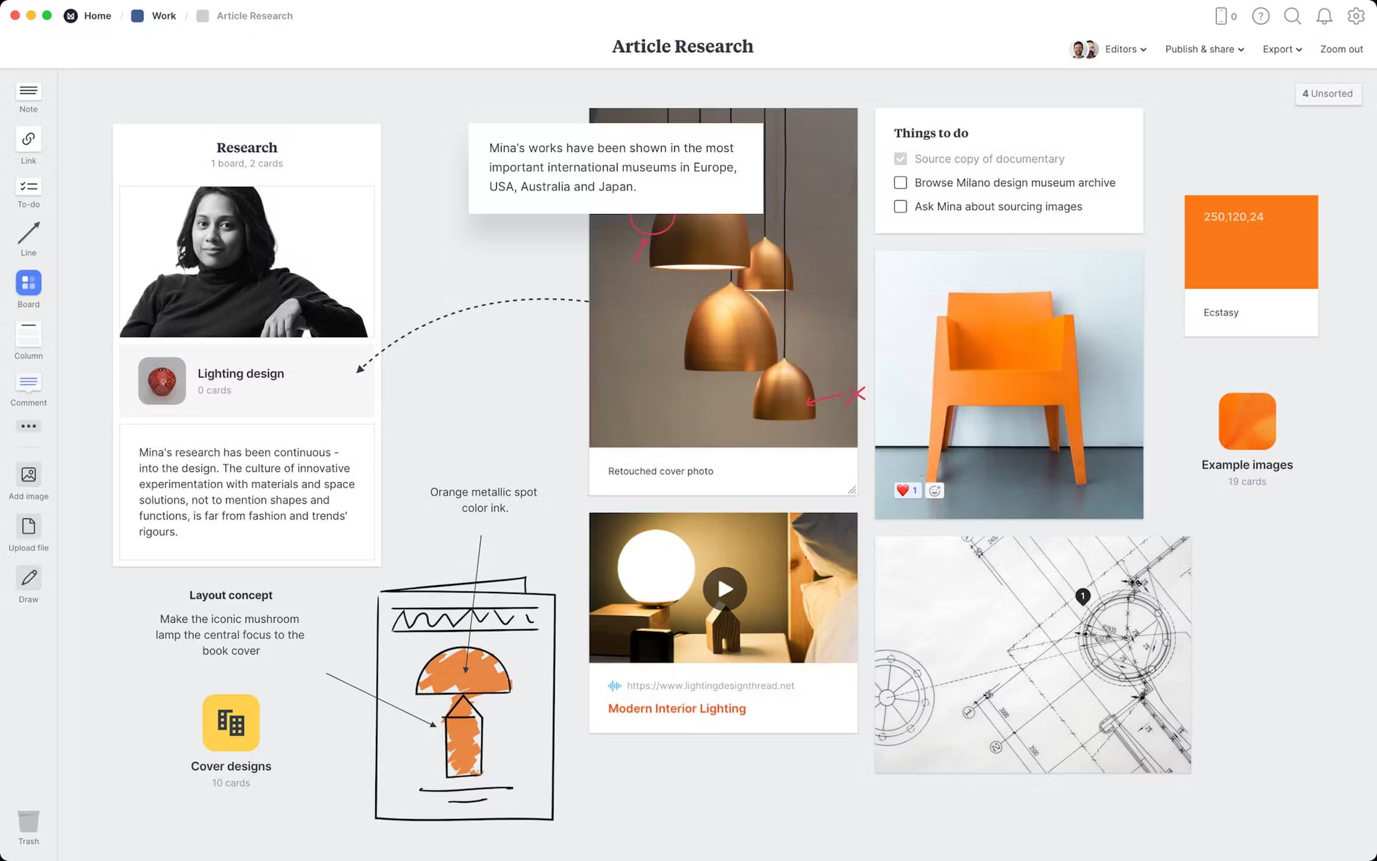
Milanote is an Australian application, aimed mostly at design teams. It offers an infinite series of infinite boards on which documents, images, web-clips, audio files, videos and notes can be placed, moved around, visually linked and organised.
Milanote, as you might expect from a design-centric app, looks great - it's clean and simple and every function is neat and immediately obvious. There is pretty much no learning curve.
The web-clipper works with Chrome browsers (including Arc). Not only can it clip article links with a summary, but it also allows you to grab an image directly with one click.
The iPad app is the same as the desktop app and the iPhone app, while not as visual, is super-easy, frictionless and fun to use.
You can export a whole board as a visual PDF or as a text document complete with links etc.
There is zero automation, which means you get to be really intentional about where you put stuff and how you arrange it. It actually feels almost analogue/physical.
God knows how long I will stay in this space, but I'm very happy with it for the moment. I feel like I can breathe again.
